Is That Graph a Little Too Perfect? Part II
Posted: 30/05/2015

In Part I we showed how to make an impressive “I-can-predict-sales” chart using a weak underlying relationship and some statistical sleight of hand. In Part II we show an actual example of such a chart produced by an agency for a client and explain how it proves absolutely nothing.
It’s been sixty years since Darrell Huff wrote “How to Lie with Statistics”. Whilst statistics itself has changed beyond recognition since then, it’s extraordinary how many of his stunts are still in circulation. In an earlier post, we demonstrated how, with some sleight of hand, a measure that is loosely related to revenue growth (R-Sq. 5%) can be made to look like you have a time machine hidden out back (R-Sq. 85%). But surely no one would actually do that in practice – right?
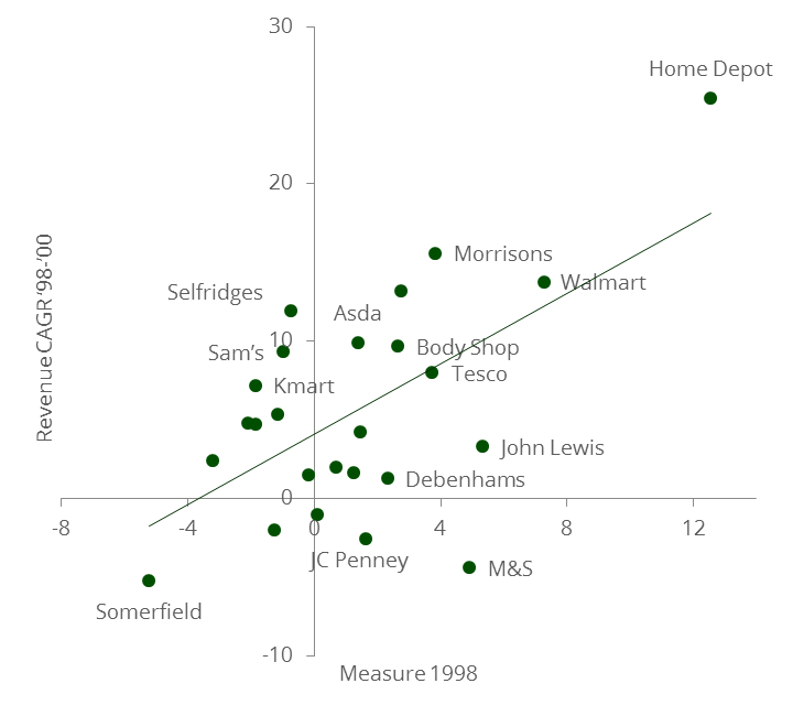
A client recently showed us this graphic. It came from an agency whose blushes we will spare. “Look,” they said wearily, “these guys claim they can predict our sales-growth with their brand health metric… if only it were true.” After thirty years of retailing, including five years as a meat and poultry buyer, this client was fairly battle hardened. But doubtless many of this large, successful agency’s prospects were more impressed and proceeded to buy a project to discover how to improve their performance on this metric.
Predicting Growth
But in truth, this graph proves absolutely nothing, for at least four reasons, three of which come straight from the Huff lexicon:
1. Outliers: The relationship depends entirely on two data points (Home Depot and Somerfield). Take them out and the trend disappears completely. Try putting your thumbs over them and eye-balling the remaining data.
2. Defining Growth: Our earlier post showed how “contextualising” growth using additional variables improves the fit. Growth here is unrelated to this firm’s reported growth over that period. We checked. This “growth” must have been derived somehow.
3. Data Mining: You can discard null results and keep searching till you get what you need. Note how these results were presented in 2012 but relate to 1998 and two years of growth. Presumably there wasn’t a good fit in the other years and for different periods.
4. Third Cause: “Correlation isn’t causation” is the catchphrase. Growth in 1998-2000 can be predicted by growth in 1996-1998. If this agency’s 1998 measure is really just a reflection of 1996-1998 growth then it has no diagnostic value.
As an agency client, there are questions you can ask to expose this kind of sting. First, how complex are the measures being used (or how unwilling is the agency to share that information)? Second, how many permutations of this chart were possible and why has the agency picked this particular version for your meeting? Third, as the old saying goes, “qui bono” or “who benefits”? If the agency has a lot to gain and it looks too good to be true, then clearly there’s a good chance it is too good to be true.
The R-Sq. reported for this chart was 43% but the actual R-Sq. of the points shown is 35%. Given R-Sq. is a scale invariant measure we are mystified by the discrepancy and can only assume the chart was felicitously mislabelled. CAGR stands for Compound Annual Growth Rate. If you remove the two outliers the R-Sq. falls to 5%. “Cui Bono” is a good question to ask when seeking the perpetrator of a potential transgression.