Is That Graph a Little Too Perfect? Part I
Posted: 10/01/2015

We show how to make an impressive “I-can-predict-sales” chart using a weak underlying relationship and some statistical sleight of hand. We advise on which questions to ask when your agency presents such a graph.
It’s agency Eden. Invent a diagnostic tool, like an ad test or brand metric, and establish an empirical relationship with sales. “We can add value and help increase revenues” they say and, because they have a graph, people buy their stuff. So it won’t surprise you to learn that we’ve also been looking for that graph. Trouble is, it’s not that easy. Specifically, we identify statistically significant links between our measures and customer behaviours, but the size of the effects are small by comparison, leaving us with an uncomfortable case of R-Sq. envy. Where did we go wrong? Are our measures actually inferior? Or are those other graphs a little too perfect?
In this post, once you’ve distracted your conscience , we’ll show you how to create an impressive we-can-predict-sales graph. In an upcoming post we’ll discuss a real-world example. We’d been puzzling over this problem for a while when an ex-agency client airily observed that “they partial everything else out first” and thereby clued us in to how it’s done. In our example, the blue dots show the kind of relationship we’ve been finding.1 It doesn’t look that impressive, and you probably wouldn’t buy the project, but in truth it contains a statistically significant Measure-Growth relationship.
Going For Growth
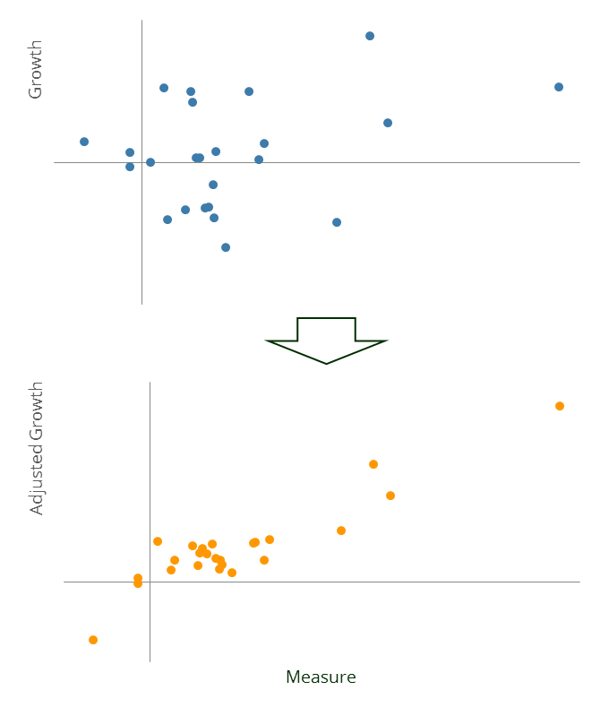
Next we add fifteen other variables and use these, in combination with the Measure, to predict Growth. In practice these might represent an honest attempt to contextualise the raw growth figures by controlling for, say, sector performance, promotion densities, product pricing, changes in distribution capacity and so forth. But actually all we need is some random noise and a good cover story. Inevitably, with enough variables and not too many data points, by pure chance, some of the new data will improve the model fit. Note how all the variables in this model, including the random noise, are statistically significant and generally everything looks kosher.
Finally we repeat the entire exercise until we find a particularly good model. Under pressure to sell their services, agencies and consultancies continually search for such relationships across countries, industries and time, and only report those few cases that work. Once we’ve stumbled upon a flattering fit, we plot the Measure against Growth that’s been adjusted to account for the other variables… and behold the orange dots. The graph is much more impressive, even though the underlying relationship is exactly the same.
You don’t have to be evil to generate this graph. You just need to be reasonably statistically inept, not cognisant of the wider activities of your firm and heavily incentivised to find the given result. A fair description of a typical “quant” agency or consultancy, most would agree.
1. If you want to do this at home, draw 25 Measure data points at random from an N(0,1) distribution. Make a Growth variable equal to Measure plus some random noise so it has a 5% R-Sq. with Measure. Generate fifteen new noise variables by taking further random draws from N(0,1). Perform a forward stepwise regression on Growth using Measure and the noise variables. Repeat this entire process 100 times and pick the iteration with the best performing regression (here the best R-Sq. came in at a staggering 83%). Residual Growth is defined as Growth minus the relevant subset of noise variables multiplied by their regression betas.